There are literally hundreds of thousands of websites of lawyers and law firms trying to get the interest of potential clients. With so much competition on the Internet, a law firm’s website only has a few seconds to engage site visitors. According to the “2013 Law Firm Website Conversion Study,” which was commissioned by LexisNexis Martindale-Hubbell, prospective clients use those first few seconds to evaluate a law firm’s website, gauge their professionalism, and determine their ability to practice law.
Consumers are growing increasingly comfortable searching for information online, even when it pertains to legal issues. However, law firm websites need to observe certain principles if they want to engage and convert site visitors. Indeed, according to the LexisNexis Martindale-Hubbell study, there are particular website elements that motivate site visitors to contact law firms, as well as particular website elements that would dissuade them from contacting law firms.
The “2013 Law Firm Website Conversion Study,” notes the feedback of participants on newer website elements—such as blogs, social media links/widgets, and videos—as well as more established industry best practices—such as prominent contact information, a professional image, and showcased experience.
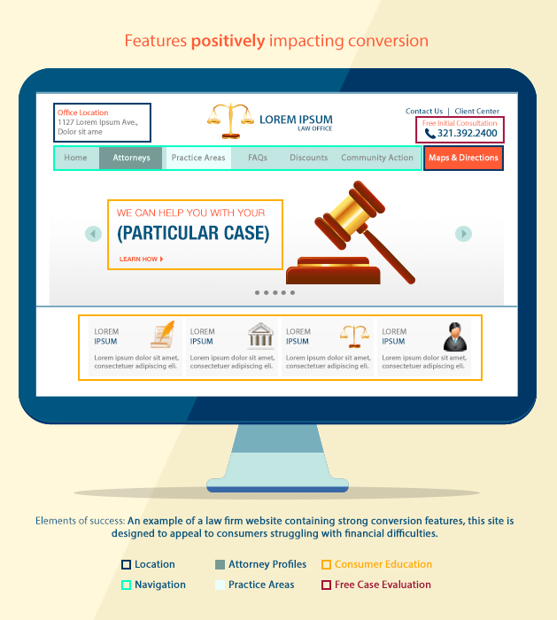
Features that Positively Impact Conversions on Law Firm Websites
The study notes that there are certain universal “building blocks of success” that positively impact conversions on law firm websites.
These elements are:
- Location
- Navigation
- Attorney Profiles
- Practice Areas
- Free Case Evaluation
- Consumer Education
- Location
The law firm’s location should be prominently featured on the website. Aside from listing the full address of the office location, participants of the study were more inclined to contact law firms that prominently featured maps and directions to their offices on their websites. - Navigation
Participants of the study wanted to know very quickly whether law firms could help them with their legal issues. Hence, law firm websites that were well-organized and easy to navigate were given very favorable ratings. Such websites allow site visitors to find pertinent information (such as information about attorneys, their practice areas, and specific legal topics) quickly and easily. In contrast, law firm websites that require site visitors to perform several clicks to determine practice areas, or require site visitors to read through a great deal of text to discover the information they need, were given lower ratings. - Attorney Profiles/ Practice Areas
Well-designed attorney profiles gave participants a greater sense of the attorneys’ skills, personality, and competence. Elements that constitute a well-designed attorney profile include photos (including photos of the attorneys), biographical information, and matter experience. Participants also wanted to discern very easily the attorney’s area or areas of practice. - Free Case Evaluation
Many participants favored law firm websites that prominently displayed offers for free case evaluations. This is because many participants were unwilling to contact law firms that charged for the initial consultation—especially if the lawyer might not ultimately take the case. - Consumer Education
High-quality, targeted, and genuinely helpful content appealed to participants. Favorable ratings were given to law firm websites that explained participants’ legal issues and offered useful educational content. Search engines like Google and Bing also favor law firm websites that regularly publish high-quality, unique, and useful content, and give much higher organic rankings to websites that meet such criteria.
In addition, participants gave the following characteristics favorable ratings:
- Prominently Featured Case Results
Participants also favorably rated law firm websites that published case results. In fact, participants did not prioritize major awards, as many felt that firms that featured smaller wins were more interested in taking on cases of all sizes. Law firm websites that only published big wins were seen as being rather intimidating, and participants were less inclined to contact such law firms about smaller matters. - Descriptions of Third-party Competitive Differentiators
Law firm websites that featured professional achievements, independent ratings, or client reviews scored significantly higher than law firm websites that lacked such third-party competitive differentiators. Participants wanted to learn more about the positive qualities that distinguished the law firm from its competitors. - Prominently Featured Videos
A considerable number of participants found professional videos on the website to be highly persuasive. As many clients do not wish to work with lawyers and law firms that make them feel uncomfortable, they will watch videos found on law firm websites that provide a compelling glimpse into the attorneys’ personalities, as well as the atmosphere of the law firm. - Well-integrated Social Media Links/Widgets
Law firm websites that prominently displayed their social media links/widgets were seen as being more accessible, and were viewed more favorably by some participants. - Responsive Web Design
Law firm websites that have been optimized for various devices—such as desktops, smartphones, and tablets—were viewed more favorably by participants. Site visitors are turned off by web pages that do not load correctly on their screens, and websites that aren’t responsive will see a precipitous drop in their traffic and conversions. Google and Bing also hate websites that aren’t responsive, and will penalize such websites.
Features that Negatively Impact Conversions on Law Firm Websites
Of course, there are also features that would negatively impact conversions on law firm websites. According to the LexisNexis Martindale-Hubbell study, the following features dissuaded its participants from contacting the law firm being featured on the website:
- Websites that Appear to be too Commercial
Participants were turned off by law firm websites that focused too much on payment or appeared to be too eager for business. While call to action terminology such as “Call us today!” might work in other niches, such language dissuades site visitors from contacting law firms. Prospects would rather hire attorneys that seem more interested in making a difference than in making a profit. - Mediocre Visual Design
Badly designed or visually mediocre websites also drive site visitors away en masse. Participants said they were less likely to contact law firms that had cluttered web pages, unappealing visuals and color schemes, as well as layouts that were difficult to navigate. - Paucity of Photos and Poorly Chosen Images
Some participants greatly disliked stock images, especially if they found the images to be emotionally upsetting. Disturbing images (such as those of injured people and accidents) were flagged, even if they related to the area of law being practiced. Participants also expressed disappointment at law firm websites that lacked pictures of their lawyers. - Missing Case Results
Participants expected case results to be prominently displayed or easy to locate, and expressed disappointment at law firm websites that did not contain this information. - Poorly Designed Contact Forms
Participants were turned off by contact forms that were unnecessarily intrusive or required extra, tedious steps to complete.
A Questionnaire for Law Firms that Want to Convert More Site Visitors on their Websites
Attorneys who want to convert more of their site visitors and lower their bounce rates need to answer the following questions:
- Does their firm’s website convey a professional image?
- Can site visitors easily determine if the law firm’s offices are nearby?
- Does the firm demonstrate its ability to handle the prospective client’s legal issue?
- Does the firm demonstrate its expertise through its website?
Anything less than a resounding “yes” should be reason enough to subject your website to expert analysis and redevelopment. Your website should be the central component of your online marketing strategy. Aside from providing a window into your firm’s positioning, strengths, and capabilities, your website should also outline the specialist skills of individual lawyers, and provide educational content that your site visitors will find useful.
With the right mix of targeted content, compelling design, and useful features, attorneys can connect more effectively with their site visitors, and convert them into prospective clients who will contact the firm for more information or set up appointments.
Does your firm’s website meet the following criteria, or is it sorely lacking in the website elements and/or characteristics that lead to successful conversions?
If your law firm website is deficient in any of the aforementioned website elements or characteristics, there’s no need to panic as we’ll be more than glad to assist you. We provide professional web design and development that focuses on keeping your website dynamic and up-to-date. We’ll incorporate all the website elements and characteristics that will reduce your bounce rate and increase your site conversions.
Additionally, we’ll optimize your website with targeted keywords and keyword phrases that will increase its rankings on the organic search results of Google and Bing. We’ll also update your website blog with useful educational content that will nurture your leads and lead them down the sales funnel, transforming them into clients. If that wasn’t enough, we’ll also set up, optimize, and update your social media accounts, and manage your interactions with your audience.
We’re experts when it comes to marketing law firms online. We’ll establish your brand presence, increase your brand’s reach, drive more qualified traffic to your website, and increase your conversions.
Contact our professional digital marketing agency today, and get a FREE consultation on how to design or redesign your law firm website and increase your conversions!
Call us, send us an email, or fill out the form and take your law firm to greater heights!


